Friday, 22 October 2010

Front Cover and Evaluation


This is my final outcome of my magazine cover. I think that my magazine cover relates to the brief really well and I have met the targets of the brief. After studying and analysing different college magazines I understood how to use the conventions in my own college magzine. I included a barcode, a dateline and an issue number to add to the authenticity of my magazine. I think that my masthead also sticks to the conventions of typical magazine as it is the first things you notice on the front cover. I also used relevant cover lines to reflect the college magazine.
I think the image that I chose to use was the best of my final four because it is very colourful and has quite a scenic background, which I think is a nice touch. The model relates to the college magazine as she is holding a folder which relate to the work side of college. However, she is very happy and smiling which portrays to the reader that college is a happy place to be involved. I decided against the other photos as I didn't think they had the potential that my chosen photo did for a front cover.
By testing my chosen photo as a front cover, I decided on my colour scheme for the magazine. As the picture is very colourful I decided to use black and white font for the cover lines, but I wanted a colorful masthead. I picked up a colour off the scarf to use for my masthead which links the whole thing together. The colour is also close to that of the Wyke logo so again relates to the college.
I think that by looking at my magazine you can clearly see that the target audience is students at college. As I chose to name my magazine 'Achieve!' this creates a wider audience and appeals to all students, not just the ones at Wyke. However, my cover lines only relate to Wyke, which maybe work against the name of my magazine. This creates room for improvement in my magazine and if i were to re-do the task I would take this into consideration.

Drafts of Front Cover

This is a rough idea of how I would like my front cover to look. I will use a purple, black and white colour scheme so it relates to the college and their logo.

Drafts of Contents Page

This is a rough idea of how I want my contents page to look. I have not used colours in this draft, however I plan to use the same colour scheme as my front cover.

Wednesday, 20 October 2010

Idea Development and Planning - Cover Line Ideas


This is a rough brainstorm of some ideas I had for cover lines on my front cover.

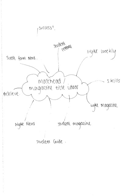
Idea Development and Planning - Masthead Ideas


This is a rough brainstorm of some ideas I had for my masthead.

Idea Development and Planning - Photographs


I took several different photos to test out for the cover of my magazine. These were my four favourite photographs and I tested each one as the cover of my magazine. I liked them all but in the end I chose the last photograph.

Saturday, 16 October 2010

Idea Development and Planning - Fonts


These are some examples of fonts I could use for my masthead. My favourite of the fonts is the third one which is quite classic and 'old school' and could maybe stereotype an American college. I think this font would work well with my college magazine and be appropriate for the brief. I like the other fonts too, but maybe think that they wouldn't work as well as the classic college font.

Conventions of a College Magazine

Whilst analysing the Secondary Teachers magazines, I noticed many conventions within college magazines. I noticed that both the covers stick to traditional conventions and the most conventional main image shot is medium close-up, which I will be using on my magazine. I could also use the other conventions on my own college magazine cover. For example, each college magazine, along with any other magazine, has a big, bold masthead to promote the magazine, my masthead will be something simple like 'Wyke News.' They also have a few cover lines to encourage the reader to read all the other articles the magazine has to offer. On my front cover I will be using college related cover lines such as: 'EMA details' or 'Wyke Halloween Party.' The magazines also have a main cover line promoting the main story, mine will be something to promote Wyke College, like '99% Pass Rate.' As well as these conventions, I have noted that all magazines include a dateline, bar code, and an issue number, which I will be using on my front cover.

Thursday, 7 October 2010

LIIAR analysis of a college magazine

This is another analysis of the college magazine "Secondary teachers." Again, the target audience is teachers and students. This front cover also aims to be simple, yet attractive to the target audience. The first things you notice about this front over are the masthead and the image. The masthead is in bold writing and automatically draws attention to the reader. The word 'Secondary' generalises that the magazine is for secondary school, so it appeals to students and teachers. However, it also has the word 'teachers' in smaller writing underneath, which suggests that the main target audience is teachers. The masthead has a twist on it from the usual masthead as it is the magazines 10th birthday. Above the main word of the mast head "secondary" it reads "happy 10th birthday, teachers magazine!" This further promotes the magazine as it tells the audience the magazine has been going on sale for 10 years, which suggests to the audience is worth reading and is very helpful.

The other main thing that the readers will notice is the picture which is right in the middle of the cover. The colours are very bright and attractive and automatically grabs the readers attention. The primary colours used in the image may suggest a younger audience eg. the students, however the colours dont dominate the whole cover so it is suitable for the teachers and professionals too. The image used also reflects the article shown as it is all about 'schools of the future.' The image of space and the rocket impacts the article well as when we think of space we think of the future, or something maybe out of this world. The rocket image is cleverly made as a pencil, which relates back to the magazine being for teachers and students.
The language used on the image / front cover also reflects what the article is about. Words such as 'endeavour', 'enterprise' and 'frontiers' all suggest a theme of space or the future, which is exactly what the article is about.  

LIIAR analysis of a college magazine

Here I am analyzing the front cover of the magazine 'Secondary teachers.' This type of magazine is for professional use of teachers and sometimes students. The magazine aims to be represented in a simple way but at the same time one that will appeal to its target audience to be inspiring and useful. 
The first thing that you notice from this magzine is the fact that the front cover continues onto the back cover. This effect is very intriguing and different for the readers. I think that this effect works very well with the concept of this magazine, which is "Do boys and girls learn differently?" The effect of having a boy on the front on one page and a girl on the other reflects the article very well.

The masthead is in a big and bold text which stands out straight away to the readers, however "teachers" is in smaller writing and this is also the target audience. The colours could be suggested to be quite boy like but the rest of the cover suggests that boys and girls are equal.
The models on the front/back page are one of the first things you notice and they are both shown quite differently. The pose of the girl is quite reserved which contrasts to the boy as he looks quite lively and this maybe portrays him as an outspoken and enthusiastic person. However, the girl looks reserved and looks like she could be a little less comfortable than the boy being outspoken and enthusiastic.   

The article headings also relfect the purpose of the article. The colours are very generic, pink for the girl and blue for the boy, which could maybe suggest differences or a divide between the genders. But, they both use the same simple font and read "Do boys and girls learn differently?" Underneath this it reads "and can your teaching redress the balance?" These are both rhetorical questions with the answer to them both being yes. However, it is wanting to provoke thought by still using question marks.

LIIAR interpretation of the brief.

Language - Media terminology. For example, medium close-up and masthead. We will be using medium close-up shots on our magazine.


Institutions - Producer of a media text.


Ideology - System of ideas and beliefs. The choices that are made to create a media text.


Audience - The target audience that the magaine will appeal to and who it will affect. My magazine's target audience will be students.


Representation - How things are portrayed to the target audience.